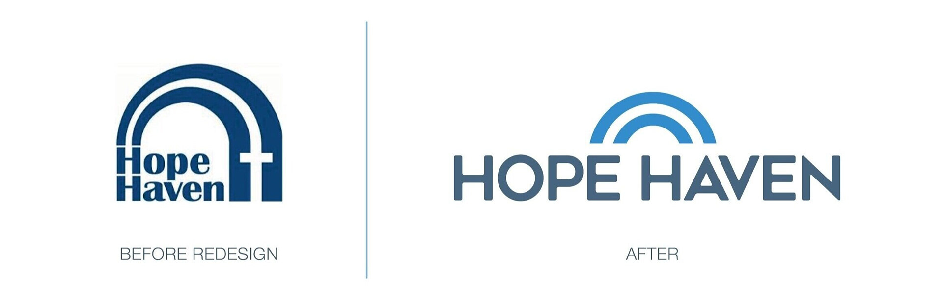
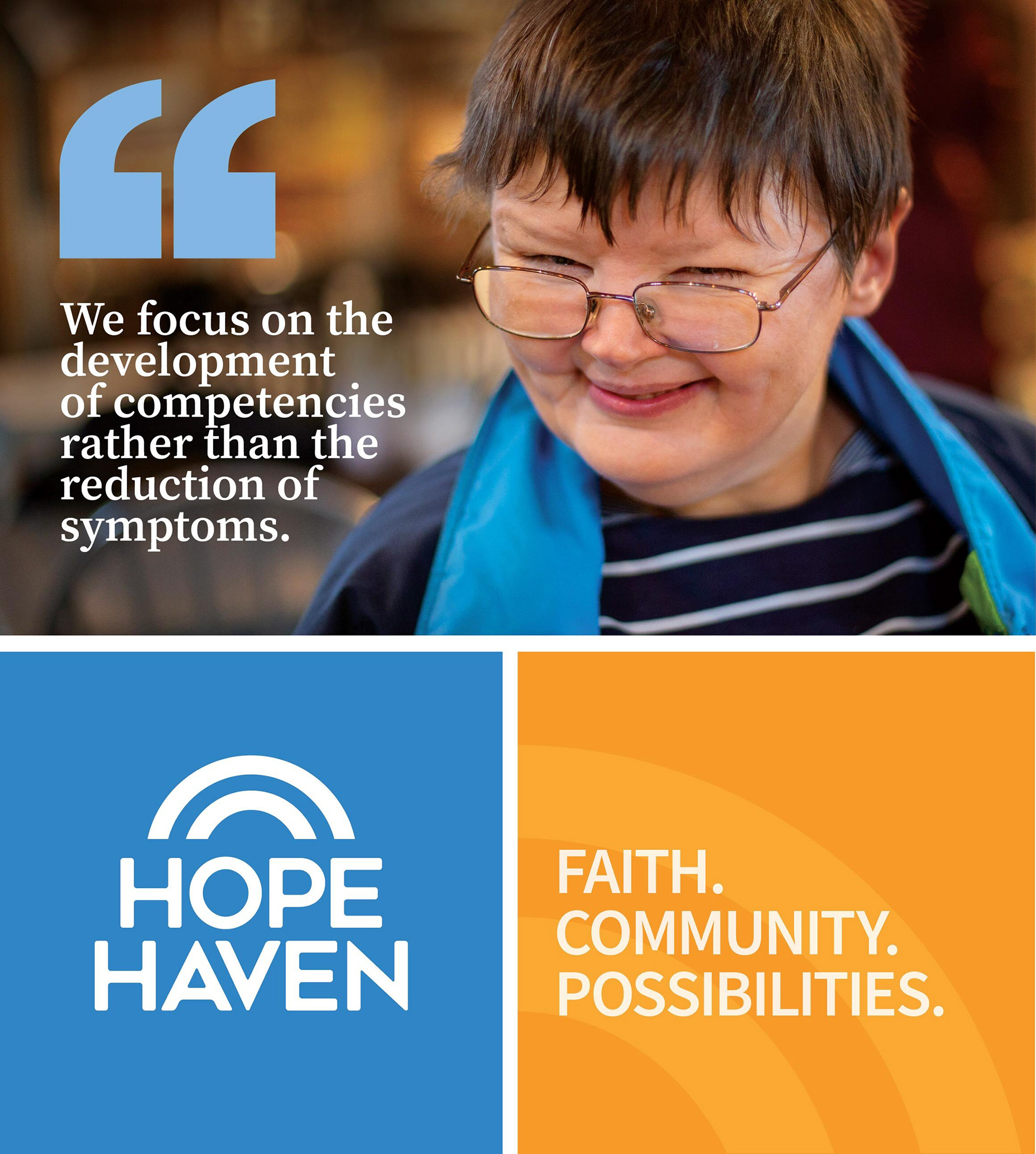
Hope Have engaged our team at Franke+Fiorella to revitalize the brand and create a new logo and visual identity. The organization is a trusted, accredited nonprofit providing disability services for children, adults and families throughout the Midwest and international outreach to 109 countries worldwide. We conducted a competitive audit, stakeholder interviews and analysis of the organization’s business objectives before developing an inspiring brand strategy and tagline to serve as the foundation for future branding work.
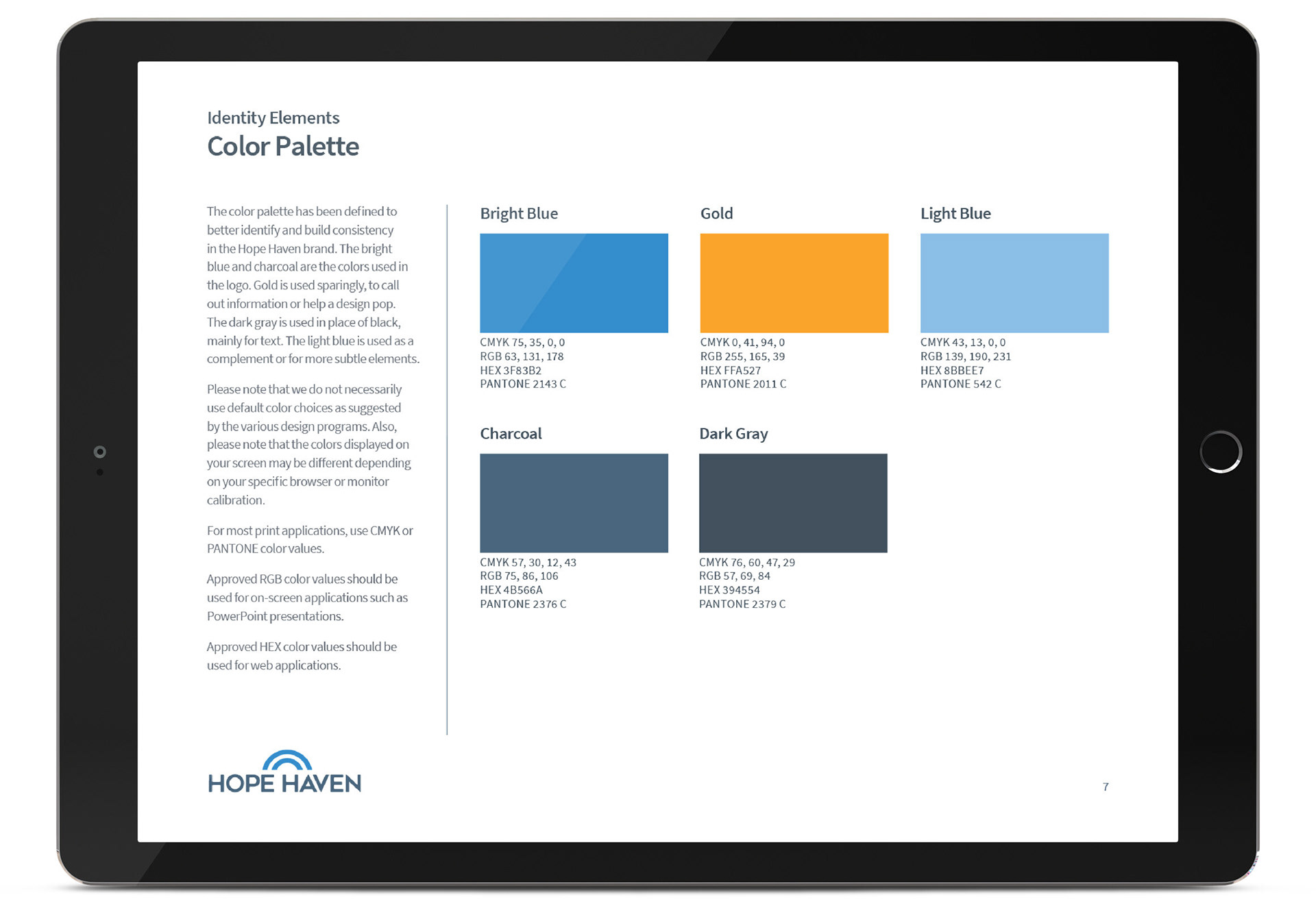
The result was a modernized logo made stronger with timeless typography, while maintaining equities in the color blue and the arc shape.
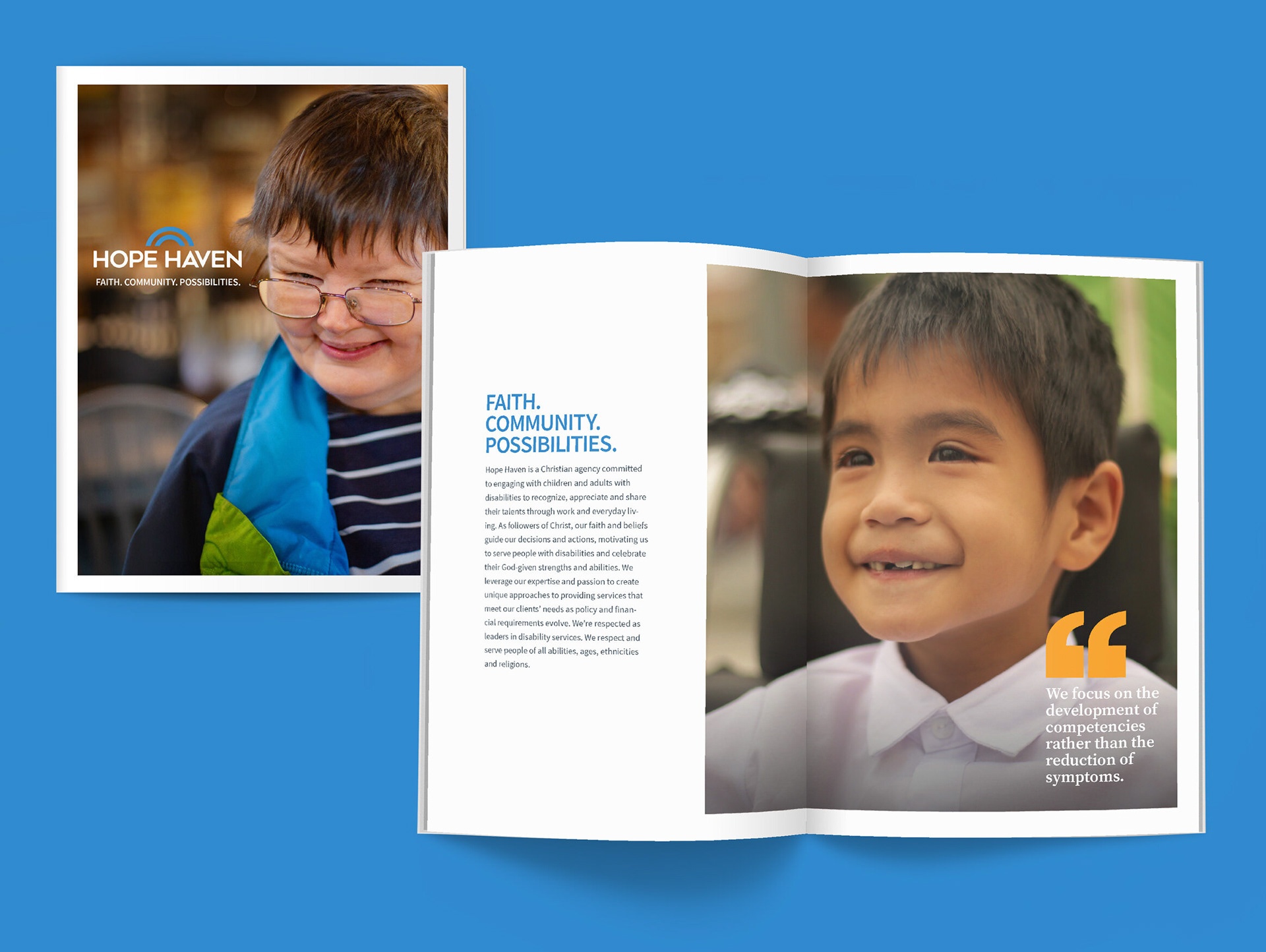
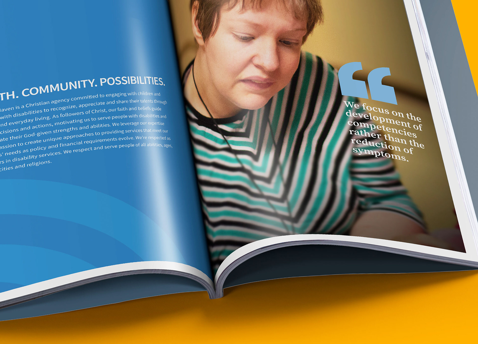
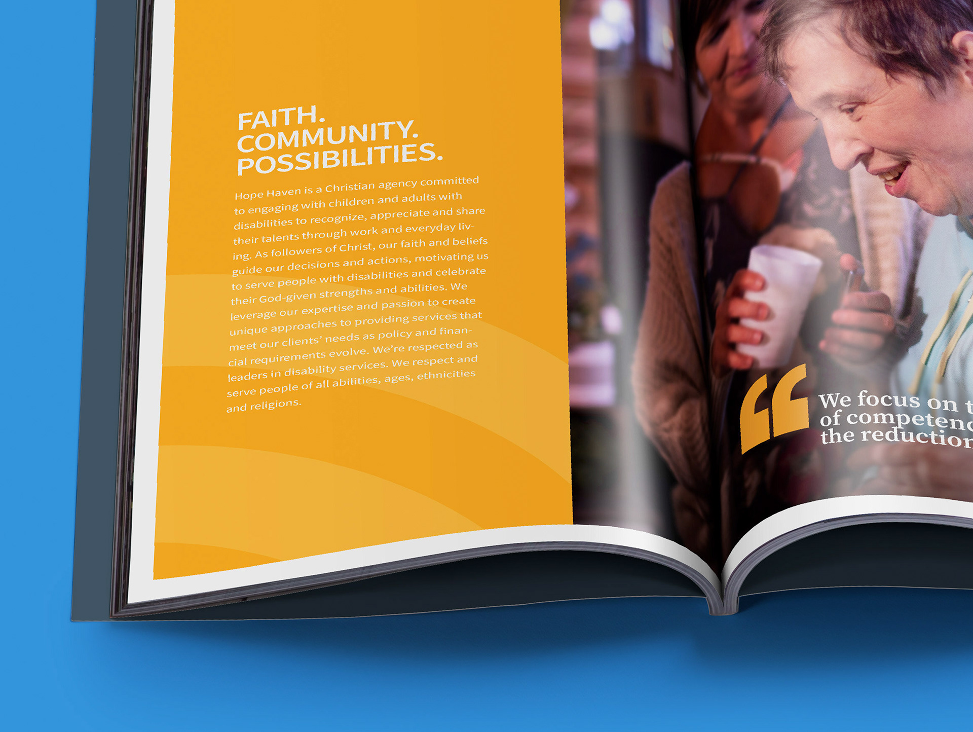
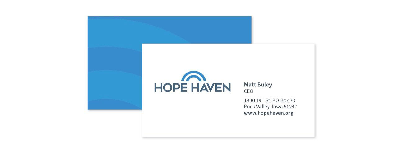
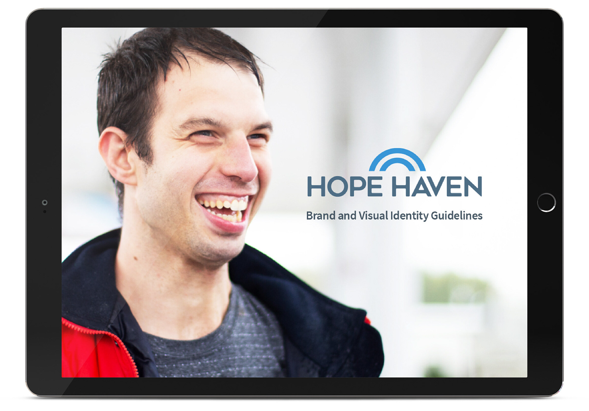
The power of the visual identity system is its simplicity. The vibrant color palette, arc shape and engaging photography showcase the connections between caregivers and those who are served, letting their stories shine through.
Creative Director Craig Franke
Design Director Todd Monge
Designer Chloe Mark
Design Director Todd Monge
Designer Chloe Mark