In 2019 Children's Minnesota reached out to our team at Franke+Fiorella to help them evolve their brand. They needed a more unified system, that was emotionally engaging and differentiated from other pediatric hospitals.
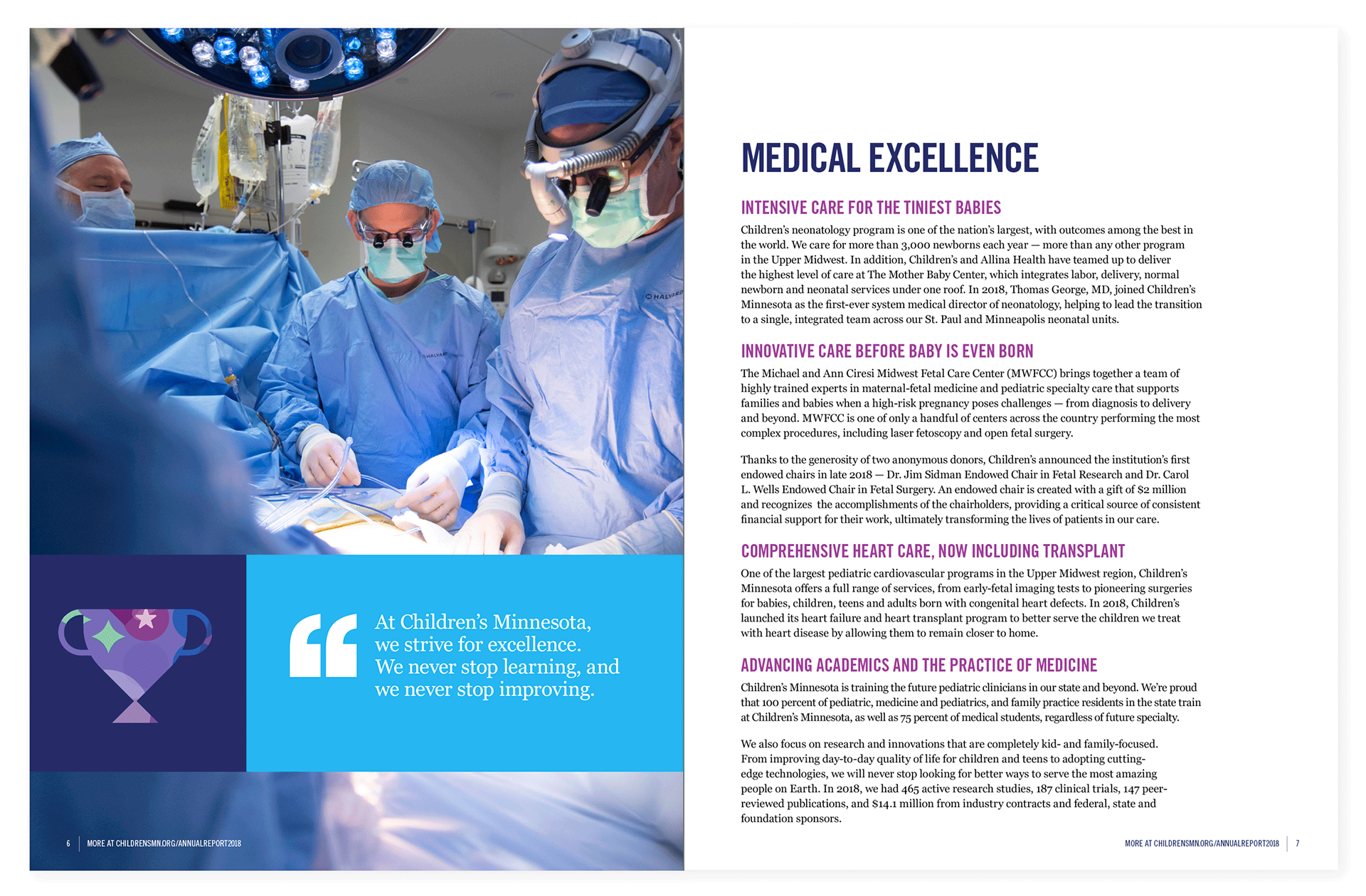
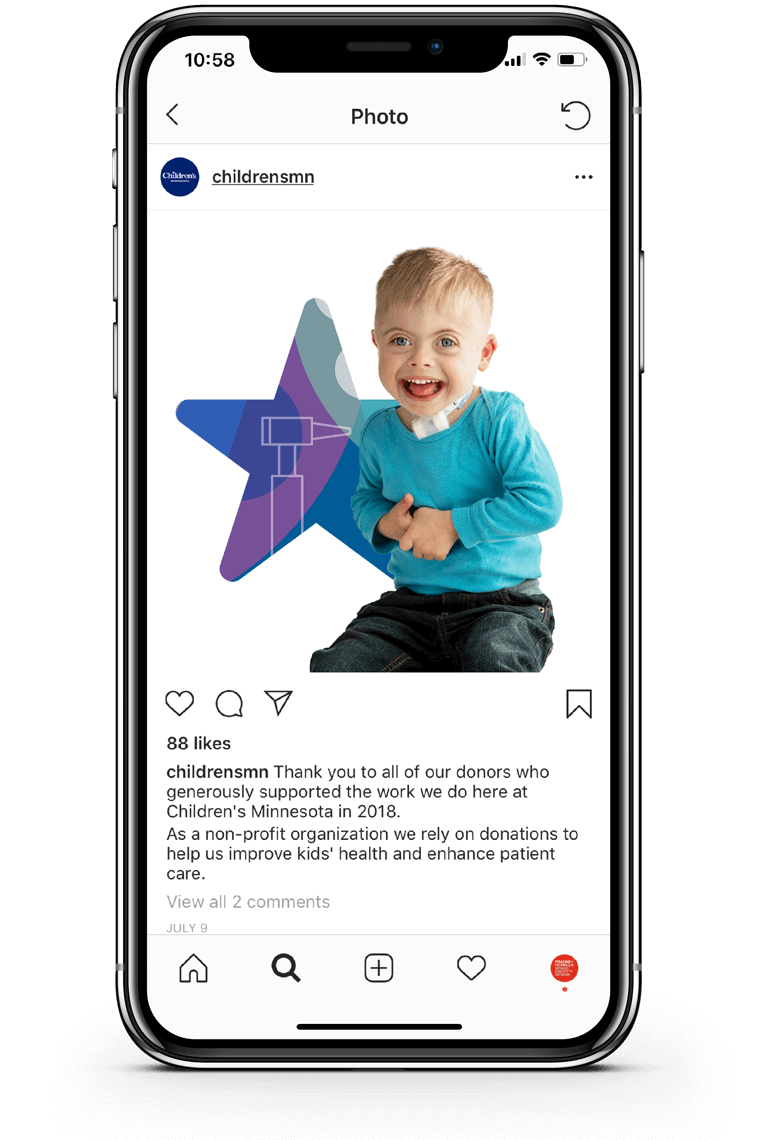
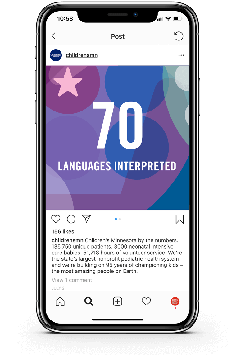
Beginning with a series of existing illustrations, we developed a new visual language—a pattern of shapes and icons that can be used on all communications from business cards to wall graphics. Next, we simplified the color palette to provide a more distinct and calming brand experience. “Hero” portraits were shot of children who had been patients at Children’s Minnesota. We recommended full color photography to express the health and vitality of these children. Finally, the graphic patterns, new color palette and photos were woven together creating a distinctive and cohesive look that was easily applied to all brand touchpoints.
Creative Director Craig Franke
Design Director Todd Monge
Designer Chloe Mark
Photography Sara Rubinstein
Design Director Todd Monge
Designer Chloe Mark
Photography Sara Rubinstein